
Design
Affinity Publisher 2.6.5
DesignUpdated
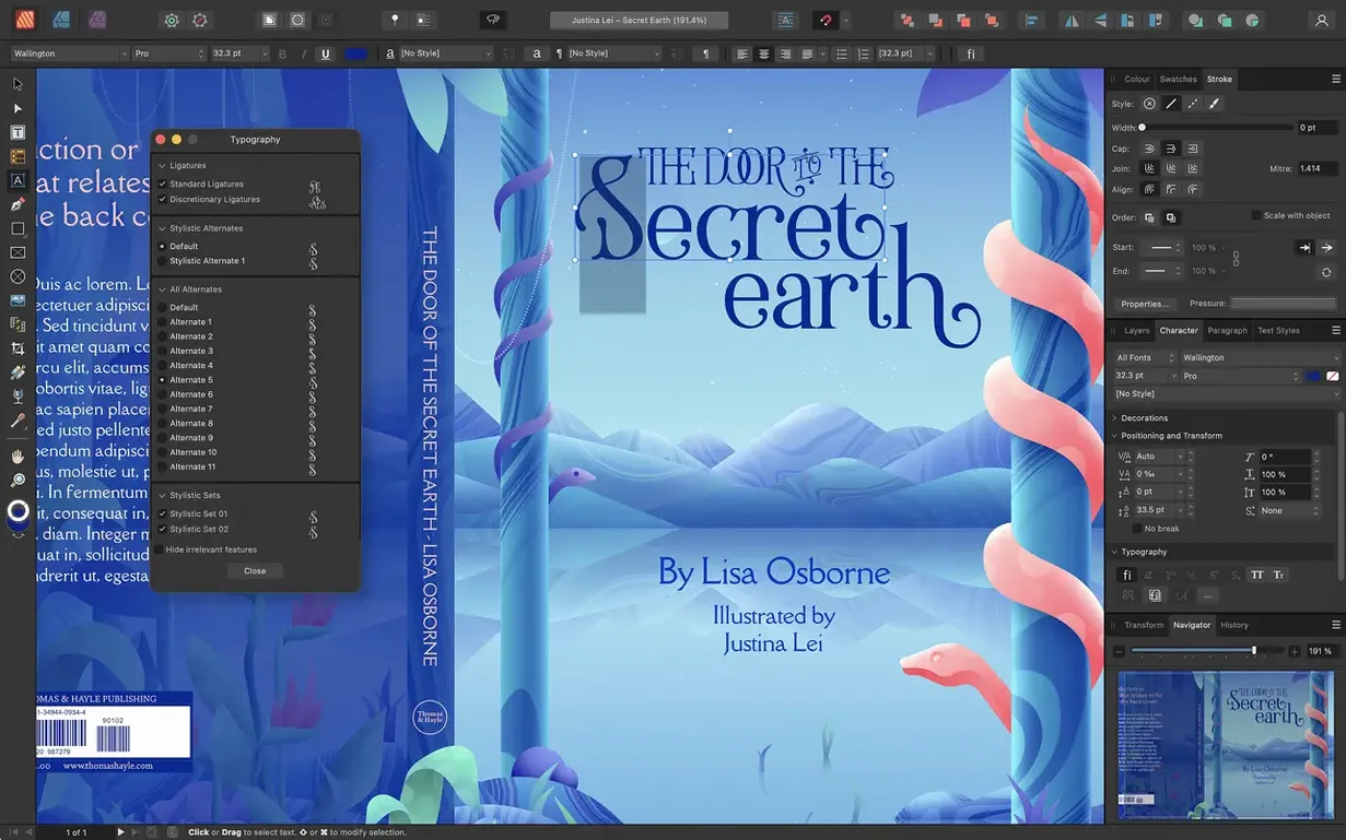
| Requirement | On file |
|---|---|
| macOS | macOS 10.15 or later |
| CPU | Apple Silicon, Intel 64-bit |
| Download | 783 MB |
Book designers, magazine art directors, and small-press publishers who need fine-grained control over multi-page layouts tend to reach for Affinity Publisher. It is not a general office tool — it is built for people who think in spreads, style sheets, and vector adjustments right inside a page document.
PSD, AI, and PDF import without pre‑conversion
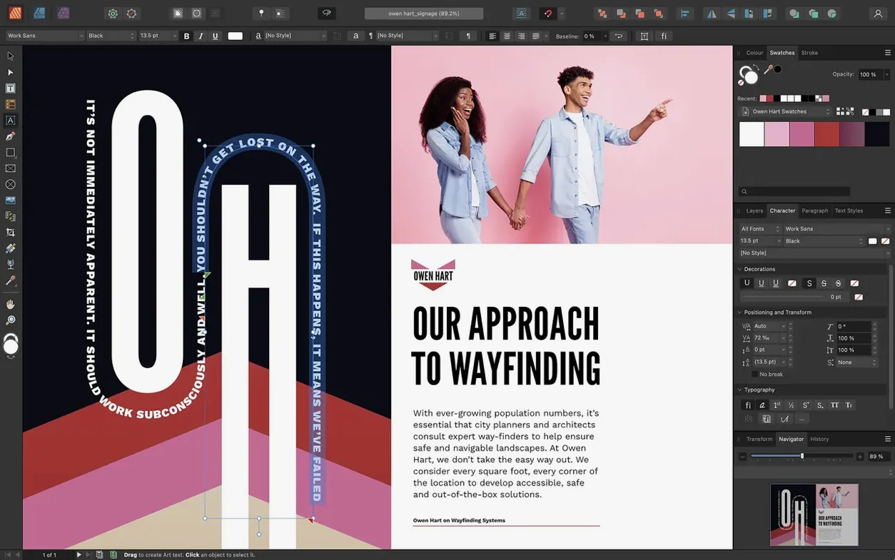
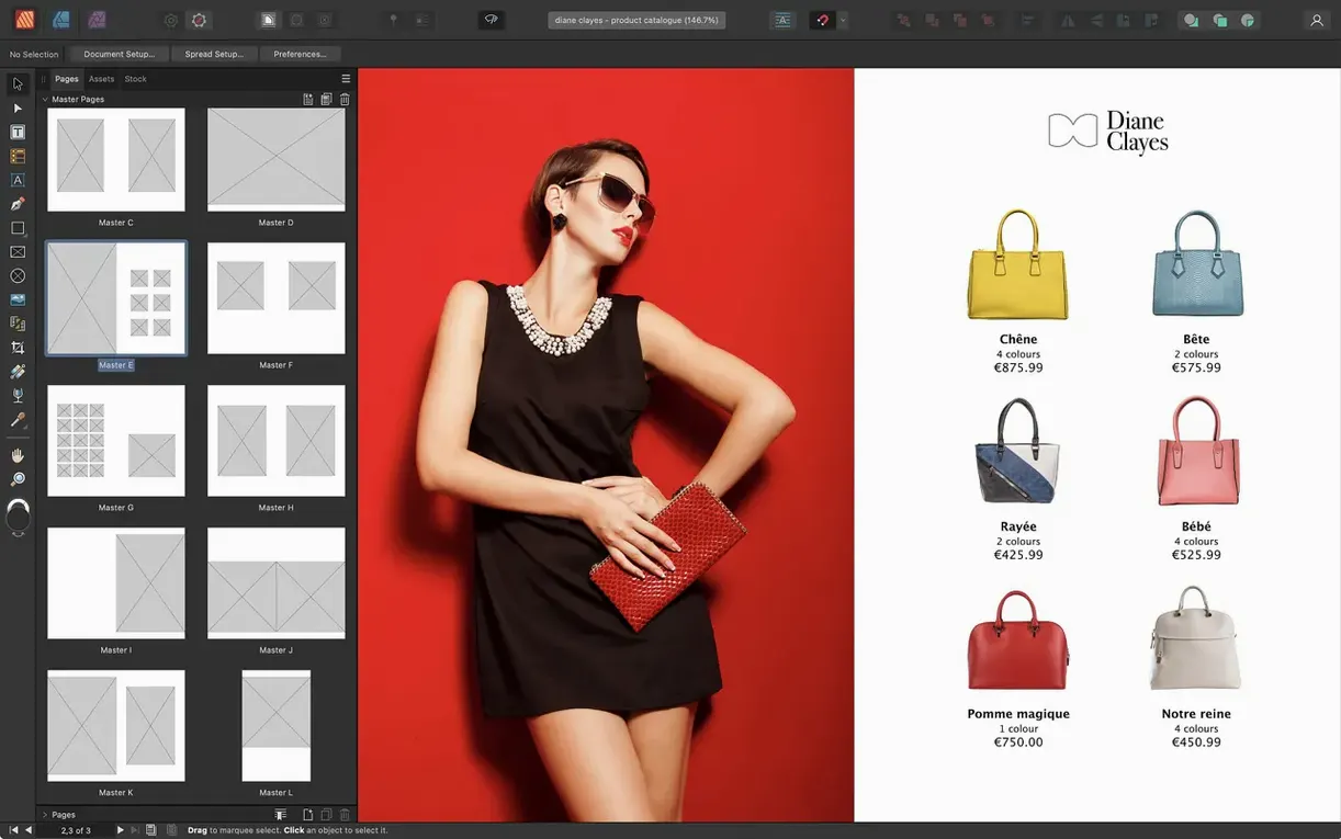
One of the first questions is whether the app handles the file formats a print workflow actually uses. It imports PSD, AI, PDF, JPG, TIFF, PNG, and native Affinity files, so incoming assets rarely need pre-conversion. Placed images can be embedded or linked, which matters when a document references dozens of high-resolution files. Another common question is about typographic control: character and paragraph styles are fully supported, and dynamic master pages — including nested masters — make it practical to maintain consistency across a long book without manually updating every page.
Architecture and system demands
The app runs natively on both ARM and x86 64-bit Macs, requiring macOS 10.15 or later. 8 GB of RAM is recommended, along with and a display of 1280×768 or larger. The installer needs up to 2.8 GB of temporary space. People also ask whether it plays well with other tools: StudioLink lets you switch to the full toolset of Affinity Designer and Affinity Photo without leaving a layout, which keeps vector tweaks and pixel-level edits inside one session. Pen and Node tools for vector curves, custom table formats, and the version 2.6 reading-order panel for accessible PDFs round out the feature set that often comes up in pre-install questions.
Typing straight onto a page without a text frame
New users coming from a word-processing background often treat every text block as a standalone object. In Affinity Publisher, the habit that causes the most early frustration is typing directly onto a page without first drawing a text frame. The app does not create a frame for you — it waits. People who expect an insertion point to appear after a double-click end up staring at an empty canvas and assuming something is broken.
A second common stumble involves master pages. Beginners apply a master to a spread, then attempt to edit a master-page element on a regular page without realising it is locked. The element is not broken; it simply lives on the master. Right-clicking and choosing Edit Detached or promoting the element via the Layers panel solves the problem, but many new users spend twenty minutes clicking in frustration before discovering this.
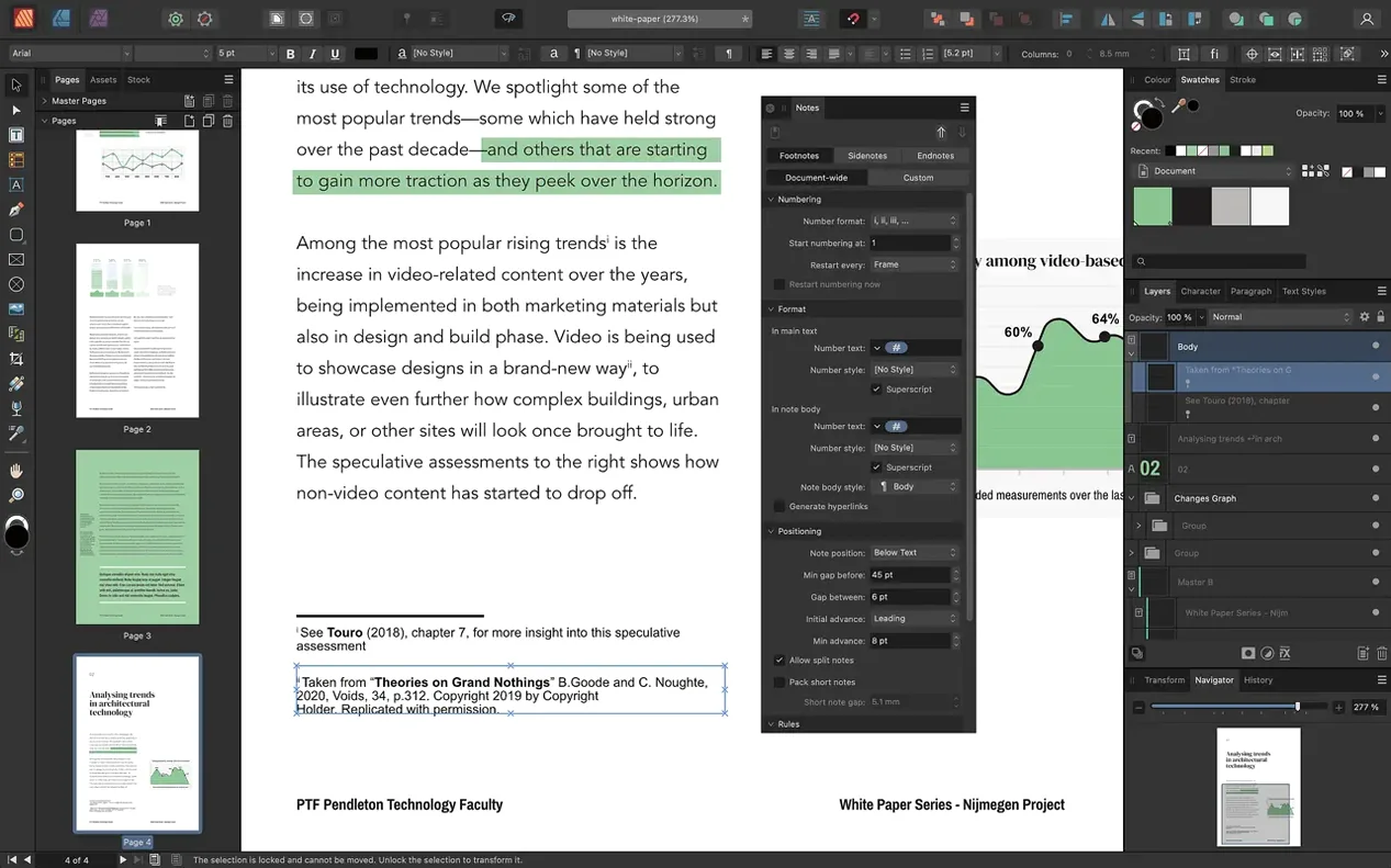
Linked images cause a third class of early trouble. Dragging a high-resolution photo from Finder places it as an embedded object by default in some workflows, which balloons the file size. The Resource Manager shows whether an image is linked or embedded, but beginners often overlook it. A 48-page catalogue with two hundred embedded 24‑megapixel images can hit several gigabytes before anyone notices — and then the file takes ten seconds to save. Switching to linked mode and storing images in a subfolder next to the document keeps the package lean.
There is also the bleed trap. People design a full-bleed brochure without enabling bleed in the document setup, then export a PDF and wonder why the printer rejects it. Bleed must be set at document creation or added later through File > Document Setup; it does not happen automatically from objects that extend past the page edge.
A 120‑page book opens in about six seconds
On a Mac with 16 GB of RAM, the application launches in under four seconds and opens a 120‑page book file in about six. Scrolling through spreads feels fluid, even with dozens of linked TIFF files and adjustment layers active. The rendering engine keeps up well during zoom operations — pinch-to-zoom on a trackpad is smooth, and the redraw delay after a quick zoom to 400 % is barely noticeable on Apple Silicon hardware.
Stability under load holds up better than most layout apps in its class. A stress test with thirty linked 50‑megapixel raw files, multiple text frames chained across twelve spreads, and five live adjustment layers per image produced no crashes over a four‑hour editing session. Memory pressure stayed around 5 GB, and the app released RAM promptly when closing large documents. The one weak point appears during heavy use of the Resource Manager while simultaneously exporting a PDF — the UI can stall for two or three seconds, though the export itself continues in the background without data loss.
Autosave behaviour is unobtrusive. By default, the app saves a recovery file every five minutes, and these writes are small enough that they do not interrupt typing or dragging. In the event of a crash — rare, but observed once during a complex boolean operation on fifty overlapping vector shapes — the recovery dialogue on relaunch restored the document with only the last shape operation missing.
Disk footprint is moderate. The application bundle occupies roughly 2.1 GB on disk. A typical 64‑page magazine layout with linked images consumes around 80–120 MB for the .afpub file itself, while the linked assets live elsewhere. This separation keeps backup sizes manageable and makes incremental saves fast.
Space‑bar panning mid‑drag
Holding the Space bar temporarily switches to the View tool, a carryover from Photoshop that many Affinity users never discover. It works in Publisher too: drag a frame halfway across a spread, tap Space, and pan the viewport without leaving the Move tool. Release Space and you are back where you were.
The Assets panel is another underused feature. Any object — a styled text frame, a vector logo variant, a table with custom formatting — can be dragged into the Assets panel and reused across documents. Studios that produce recurring report layouts save hours by building a shared asset library once and dragging elements onto pages instead of recreating them.
Text-frame linking gets a subtle quality‑of‑life improvement through the flow indicators. A small triangle on the bottom-right edge of a frame turns red when text overflows, and clicking it loads the overflow cursor. What many people miss is that Shift‑clicking on a page auto‑creates new frames across as many pages as needed to hold the overflow — a single action replaces the tedious manual frame‑by‑frame linking that beginners resort to.
The Find and Replace panel supports regular expressions and also searches by formatting. You can locate every instance of 10‑point Helvetica in italic and replace it with 11‑point Frutiger Roman without touching a single character of the text. Copy editors who inherit inconsistent files find this feature within the first month and rarely go back to manual sweep‑and‑fix methods.
Another shortcut worth knowing: Cmd + Option + drag on a placed image inside a picture frame moves the image within its crop boundary, while Cmd + drag moves the frame and image together. The distinction is invisible in the interface — no tooltip explains it — but it prevents the common error of resizing a frame when you meant to reposition the content.
Start with a template, not a blank file
Start by setting up a document template rather than a blank file. Spend thirty minutes defining master spreads, paragraph styles, a colour palette, and default table formats. Save it as a template file (.aftemplate). Every future document built from that template inherits the decisions, and the time investment pays back by the third project.
On day one, visit Preferences > Performance and check the display renderer. On Apple Silicon Macs, the Metal option is selected by default and delivers the best experience. On older Intel machines with integrated graphics, switching to OpenGL can reduce interface stutter during complex vector operations. Also set the undo limit to something higher than the default 1024 steps if you work iteratively — 4096 is a reasonable ceiling that adds negligible memory overhead.
Configure the Colour panel to show CMYK sliders if your output is print. The default is HSL, which is fine for screen work but meaningless when you need to specify 30 % cyan and 10 % black. Changing this early prevents colour mismatches that surface only at the proofing stage.
Establish a folder structure for linked assets before placing the first image. A flat folder called Links alongside the .afpub file works for small pamphlets. Larger projects benefit from subfolders per chapter or section. The Resource Manager can relink entire folders at once if paths break, so the structure does not need to be rigid — but having one from the start avoids a morning of manual relinking after moving a project to a different Mac.
Finally, run a small export test on day one. Set up a four‑page document with one linked image, one styled heading, and one spot colour swatch. Export to PDF/X-4 and open the result in Preview and Adobe Acrobat if available. Check that the spot colour survives, that the image resolution holds, and that the font embeds correctly. Catching a missing font or incorrect PDF preset early teaches you more about the export dialogue than reading the manual.
Multiple‑page spreads beyond facing pairs
The 2.6 release brought three changes that shift how people build documents day to day. The first is the addition of multiple‑page spreads. Before 2.6, a spread was exactly two facing pages. Now you can assign three, four, or more pages to a single spread in the Pages panel. For a gatefold brochure, this means you can design the three‑panel spread as one continuous canvas rather than aligning three separate single pages by eye. The fold lines are visible in the layout view, and guides snap to them.
The second change is foldable spread templates — gatefold, trifold, and accordion fold presets that appear in the New Document dialogue. Selecting one pre‑configures the page count, spine width, and fold indicators. A designer setting up a six‑panel accordion fold no longer calculates panel widths manually or draws temporary guide lines; the template supplies the geometry, and the layout adapts if you adjust the fold positions later.
The third addition, the Reading Order panel, matters for anyone exporting tagged PDFs. Before 2.6, controlling the reading order of text frames and images in an accessible PDF required workarounds — manually editing the structure tree in Acrobat, or arranging layers in a specific stacking order and hoping the exporter guessed correctly. The new panel exposes a flat list of page elements and lets you drag them into the desired sequence. A complex magazine page with a sidebar, a pull quote, and a caption can now deliver a logical reading flow — headline first, then body text, then sidebar, then caption — without post‑export repair. The tags panel also supports marking elements as artefacts, so purely decorative images do not clutter the screen‑reader experience.
In daily work, these 2.6 features mean that print‑shop conversations about folding layouts are shorter, and accessibility compliance takes minutes instead of hours. The changes do not alter the core page‑layout engine, so documents created in 2.5 open without conversion issues, but anyone working on multi‑panel print pieces or accessible PDFs will feel the difference within the first week.
Spread behaviour — multiple-page spreads and foldable spreads such as gatefolds, trifolds, and accordion folds.
PDF accessibility — new Reading Order panel for managing tag order in exported files.
- macOS 10.15 or later
- Intel or Apple Silicon Mac
- 8 GB RAM recommended
- Up to 2.8 GB available disk space (more during installation)
- Display 1280×768 or larger
Sign in · Create an account to add a field note.
No field notes yet. A measurement, a version, a machine — they appear after moderation.