
Design
Art Text 4 4.5.10
DesignUpdated
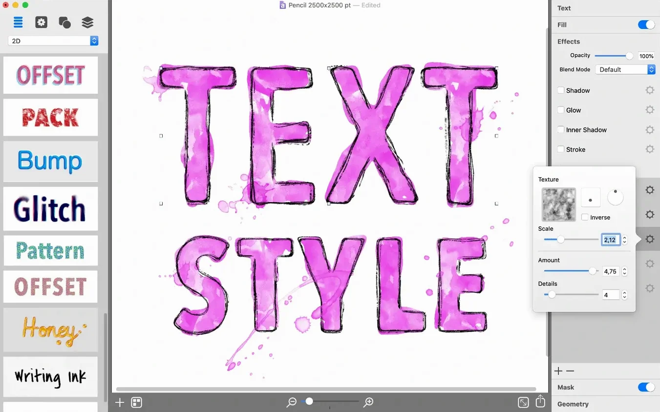
| Requirement | On file |
|---|---|
| macOS | macOS 10.14 or later |
| CPU | Apple Silicon, Intel 64-bit |
| Download | 750 MB |
Plain text set in a standard font rarely holds attention on a social feed or product mockup. When a headline needs to look like brushed metal, a badge needs dimensional shading, or a logo comp needs layered fills, rebuilding those effects manually in a general-purpose image editor eats up a project’s first hour. Art Text 4 collapses that hour into a few deliberate clicks.
One task: a YouTube channel badge
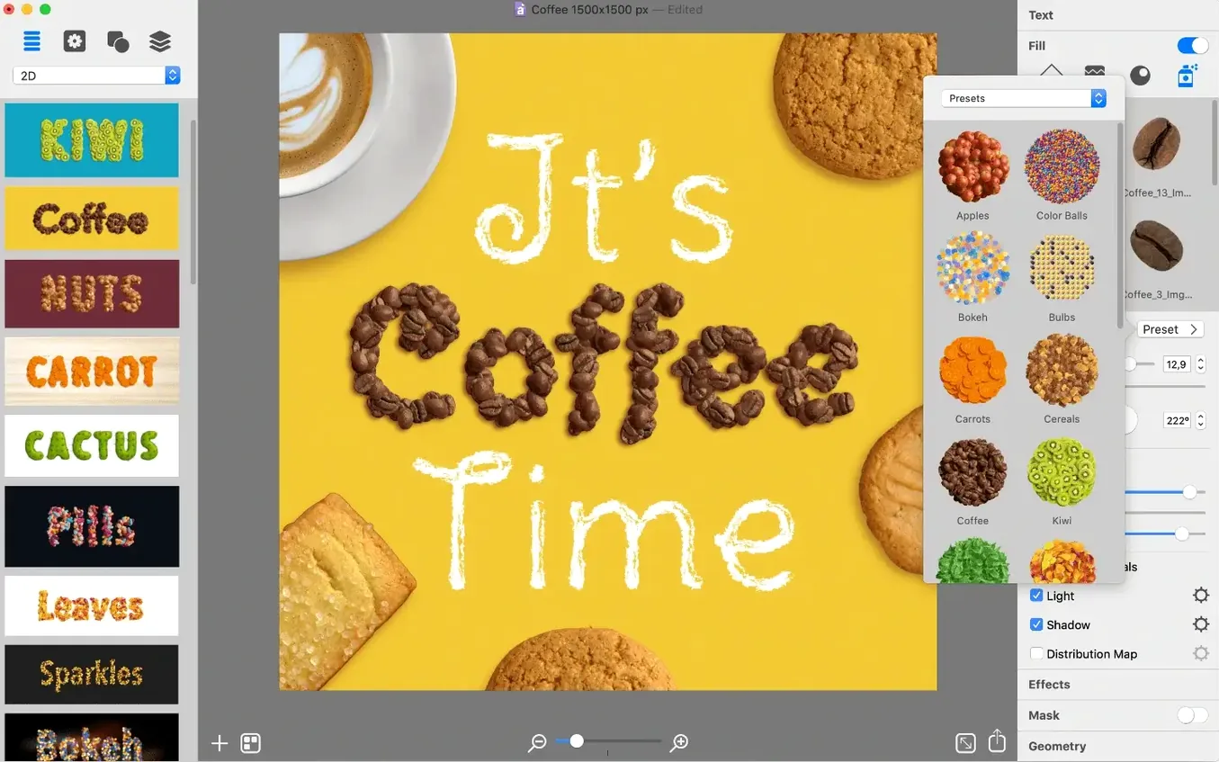
- Pick a preset from the 110-entry library as a starting point — a chiseled concrete style gets close to the desired look.
- Replace the placeholder word with the channel name; adjust kerning and size directly on the canvas.
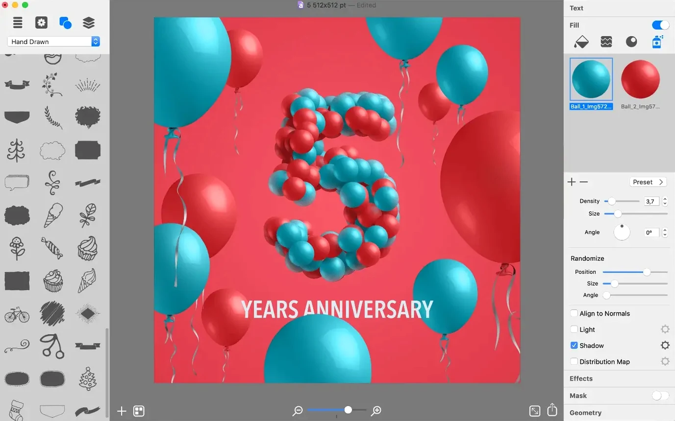
- Swap the background for one of the 400 included vector icons, then tune the fill gradient and shadow distance in the material panel.
- Export the finished badge as a PNG at the target pixel dimensions.
How the tool fits a production workflow
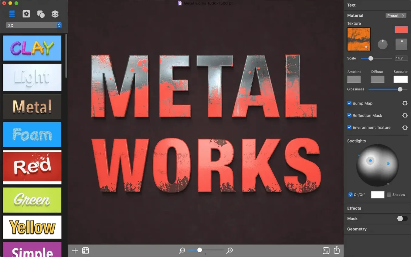
The app treats text blocks and vector shapes as malleable surfaces. Surface materials, bump maps, environment lighting and geometry transforms stack in a layer list that behaves more like a 3D shading model than a traditional effects palette. Because every element remains editable — typeface, glyphs, icon choice, extrusion depth — a single source file can generate flat print-ready PDFs, masked PNGs for video overlays and high-res TIFFs for print proofs without rebuilding the composition. The six export formats cover the common hand-off points, and universal binary support means the renderer runs natively on both Apple Silicon and Intel Macs from macOS 10.14 onward.
Workflow: building a layered T-shirt graphic from scratch
Pre-made presets save time, but a from-scratch run reveals how the material stack actually behaves. The goal here is a two-word band logo — distressed, slightly bowed, with a scorched orange-to-charcoal gradient that looks printed on cotton.
- Open a blank document and set the canvas to 3600 × 4200 px — enough for a 12-inch print at 300 DPI.
- Type the band name in a heavy sans-serif (something like Impact or a supplied system bold). Lock the font choice early; swapping later resets some deformation settings.
- Deselect any preset. In the Materials tab, add a Gradient Fill layer and set the stops manually: one stop at #F15A24, the second at #2E2E2E. Pull the angle to roughly 140° so the burn reads top-left to bottom-right.
- Stack a Distress Mask underneath the fill. Crank the density to about 70% and lower the scale so the wear pattern hits the letter edges without chewing through the counters. Preview at 100% — tiny gaps read as threadbare fabric later.
- Add a Geometry Transform layer. Enable Arc deformation, set bend to −12°, and nudge the vertical offset until the baseline bows upward. Keep the arc subtle; more than 15° makes ascenders look drunk.
- Apply a Drop Shadow with zero blur and a 6 px vertical offset. Set the shadow colour to #1A1A1A at 40% opacity. The hard edge mimics a screen-print misregistration — useful for merch mockups where a vector-perfect render would look sterile.
- Slot a faint Noise Bump map above the gradient to break up the smooth fill. Bump height around 4–6% is enough to catch imaginary light without turning the text into sandpaper.
- Export twice: a layered PDF for the print supplier and a flattened PNG for the online store preview.
The whole sequence runs under ten minutes once the material stack order becomes second nature. That stack order matters more than any single setting — fills, masks, bumps and transforms composite top-down, and moving a distress layer above a gradient produces a completely different edge treatment than nesting it below.
Option‑drag to duplicate a material layer instantly
Several shortcuts live in plain sight but rarely get clicked during the first week of use.
- Option‑drag a material layer to duplicate it within the same stack. Faster than the plus button when you want two gradient fills with different blend modes on the same text object.
- The icon search field in the shape browser accepts partial terms — typing “arrow” surfaces the 17 arrow variants across the bundled 400+ icons without scrolling through category folders.
- Right‑click any colour swatch in the gradient editor to copy its hex value. There is no visible button for this, but the clipboard picks it up cleanly for pasting into a brand guide or CSS.
- Holding Shift while scaling a text box constrains proportions, but holding Shift while dragging a gradient stop snaps the stop to 0°, 45°, 90° and so on — handy for precise colour banding.
- The Export Size dialog remembers the last five dimensions per session, so bouncing between a 1080p social cut and a 4K proof doesn’t force re‑entry of pixel values each time.
Avoiding canvas, material order, and font snags
Most friction points trace back to three areas: canvas setup, material ordering, and font handling.
Canvas size mismatches for print
Art Text defaults to a screen‑resolution canvas. If a design meant for 300 DPI print looks soft when exported, check the document DPI setting under File → Canvas Size. Raising it from 72 to 300 inflates the pixel dimensions automatically — an 8‑inch‑wide layout jumps from 576 px to 2400 px. Do this before adding materials; certain bump map scales recalculate awkwardly after a DPI change.
Bump maps that look like gravel
The default bump intensity on some presets is calibrated for display type above 200 pt. For body copy or anything under 80 pt, drop the Bump Height slider to the 2–5% range. At 100% zoom the difference is barely visible, but at export resolution a heavy bump map turns serifs into jagged messes.
Fonts missing from the system
Art Text pulls directly from the macOS Font Book. If a project opens with a substitution warning, the missing font name appears in the layers list struck through. Installing the font and restarting the app restores the layer intact — the app stores the original PostScript name, so re‑linking is automatic. No manual re‑assignment step needed.
Deformation distortion on multi‑line text
Arcs and waves apply per‑glyph by default on multi‑line blocks, which can make the second line bow in the opposite direction. Toggle the Per Character checkbox off in the Geometry Transform panel to treat the entire text block as one surface. The arc then flows evenly across all lines.
Disable the preset picker on launch for a cleaner start
Right after launch, a few preferences shift the app from demo‑mode behaviour to production‑ready defaults.
- Disable “Show Preset Picker on Launch” in Art Text 4 → Preferences → General. The preset browser is useful, but forcing it every cold start adds a click to every session. It stays available from the File menu when needed.
- Set the Default Export Format to PNG rather than TIFF if most output goes to web or screen. The TIFF default produces files that are unnecessarily large for social media drafts; switching it saves a format‑picker trip on the first dozen exports.
- Under Preferences → Editing, enable Show Rulers and set the ruler units to pixels. Art Text positions elements by canvas coordinates, and guessing an offset by eye is slower than reading a tick mark.
- Increase the Undo Steps limit from the default 30 to 100. Material tweaks are single‑step actions, and a run of twenty micro‑adjustments eats the default undo history faster than expected.
- Set the Colour Profile to sRGB for screen‑bound work or Adobe RGB for print. The factory setting uses the display profile, which can shift colours subtly when the file moves to another Mac.
- Maintenance — minor technical improvements, no changes to file formats or system requirements
- macOS 10.14 or later
- Apple Silicon or 64-bit Intel processor
Questions on file
Which export formats does Art Text 4 provide?
It writes TIFF, JPEG, PDF, EPS, GIF and PNG files.
What macOS version does the current release require?
Version 4.5.10 requires macOS 10.14 or later and runs natively on both Intel and Apple Silicon Macs.
How many preset designs and vector icons are included?
The app ships with 110 preset designs and more than 400 vector icons.
Sign in · Create an account to add a field note.
No field notes yet. A measurement, a version, a machine — they appear after moderation.