
Design
Typeface 4.5.0
DesignUpdated
| Requirement | On file |
|---|---|
| macOS | macOS 12 or later |
| CPU | Apple Silicon, Intel 64-bit |
| Download | 23 MB |
Version 4.5 of Typeface changes how you handle recent work: fonts can now be sorted by last activated date. A new Last Activated column makes it easier to pick up where you left off in a project, and a Notes field in the Info tab lets you attach your own context to each font.
Preview, Compare, and Group Fonts by Project
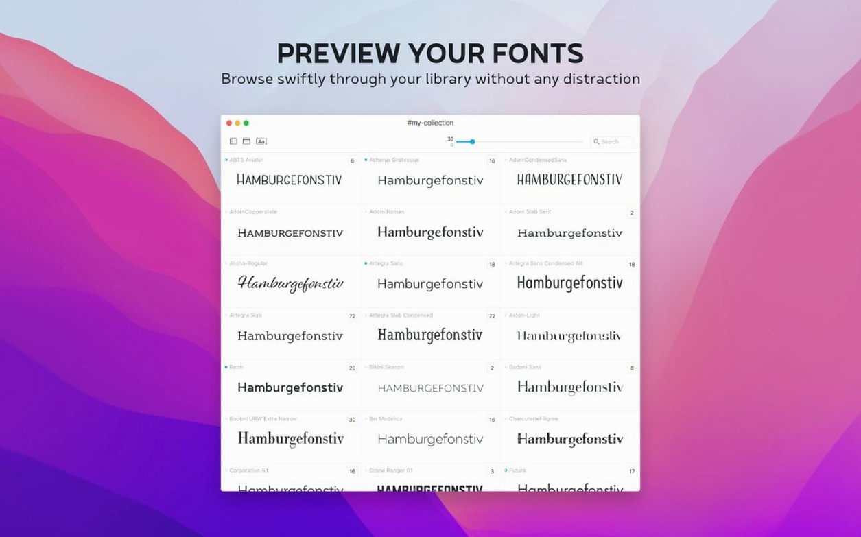
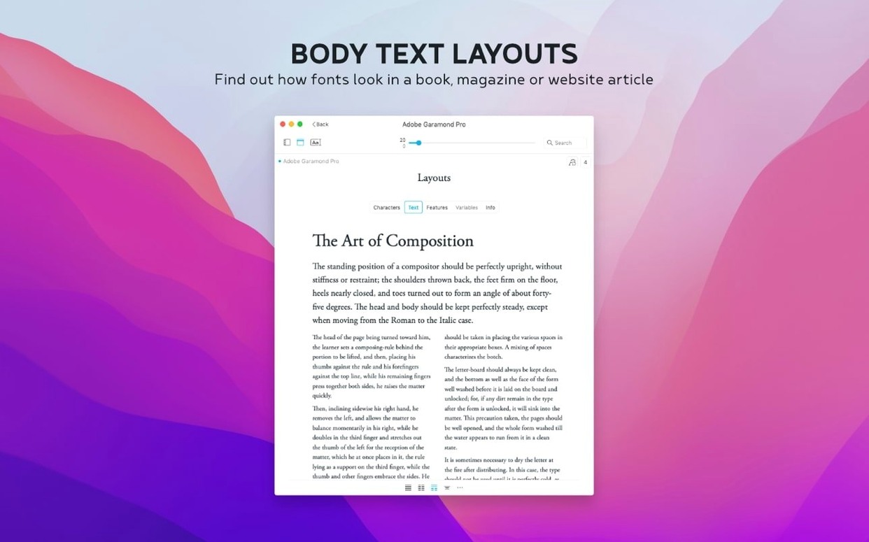
- Previewing all installed Mac fonts, including custom ones, with adjustable size, sample text and weight.
- Comparing fonts side by side before committing one to a layout.
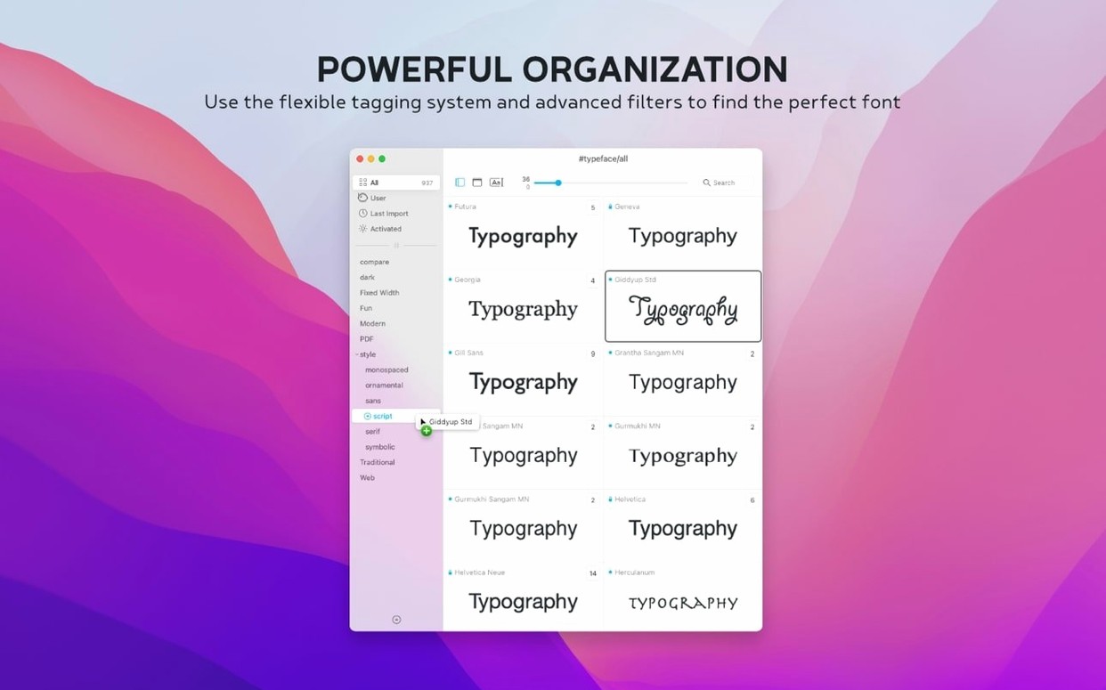
- Organising fonts into custom collections that match project or client needs.
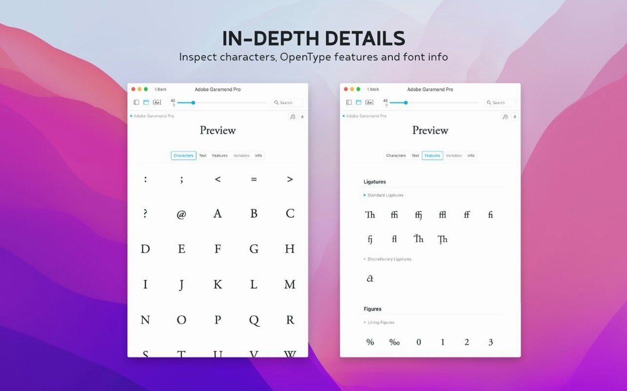
- Reviewing metadata, copyright history, tags and groups in the information tab.
- Importing fonts from other managers or from the internet, with .otc support now included.
A Standalone Manager Without Layout Tools
- This is a lightweight, standalone macOS font manager, not a full design suite.
- Preview effects are limited to settings such as size, sample text and weight.
- Interface languages cover English, German, Dutch, French, Czech and Japanese.
The Glyphs Tab Hides a Full Character Map
A few details in Typeface 4.5 sit just outside the main workflow and take a week or two to surface. One is the glyph set panel. Double-click any font in the overview and switch to the Glyphs tab. It lays out uppercase, lowercase, numbers and special characters in a single scrollable grid. You can copy any character straight from the grid with a right-click, which saves a trip to macOS Character Viewer when you need a specific numeral style or an uncommon diacritic.
Another is the sample text field in the preview toolbar. It ships with a default pangram, but it remembers the last six strings you typed. Press the down arrow inside the field to recall a previous sample without retyping. If you review fonts for multilingual projects, keep a short German or French sentence in the history — switching between them takes one keystroke.
The tag system is worth a closer look. You can assign a font to more than one tag, and tags appear as clickable filters in the sidebar. Tag a font with both "client-logo" and "narrow-condensed" and it shows up under either filter. The Info tab also exposes the full tag list for a selected font, where you can add or remove tags without opening a separate dialogue.
Version 4.5 added a Notes field inside the Info tab. It is plain text, no formatting, but it is indexed by the search bar. Type "draft only" or "check licence" into a note, and that font appears when you search for those words in the overview. The search scope covers font names, family names, tags and notes simultaneously — you do not need to choose a category first.
Launching with 1,200 Fonts Takes Under Two Seconds
Typeface launches in under two seconds on an M1 Mac with roughly 1,200 fonts activated. The font list populates immediately; there is no progress bar or indexing delay unless you import a large batch for the first time. Importing the full Google Fonts library — over 2,000 families — takes about 90 seconds on a fast connection, and the app remains responsive while the download runs in the background.
Memory usage sits around 180–220 MB with a typical library open and the preview panel active. That figure climbs modestly when you load a large glyph set grid, but the app releases memory quickly when you switch away from the glyphs tab. CPU activity is near zero at idle. The only sustained CPU spike I see is during a side-by-side comparison of 40 or more fonts at once, where redrawing all preview tiles pushes a single core to about 45% for a few seconds.
Stability has been uneventful across three weeks of daily use on macOS 14 and 15. No crashes during import, no hangs when quitting with unsaved collections, and no font activation conflicts with other managers running alongside it. Version 4.5's .otc support handles multi-font OpenType Collection files without splitting them — they appear as a single entry with all contained fonts listed in the family view.
The app respects macOS accessibility settings for reduced motion and increased contrast. It does not install a kernel extension or a background helper, so it leaves no processes running after you quit. For a tool that touches the system font database, that restraint is worth noting.
A 20-Minute Hunt Through a Magazine Redesign Collection
Here is how a 20-minute font selection task unfolds in Typeface, step by step.
Step 1 — Open the project collection. I click the "Magazine redesign" collection in the sidebar. Forty-three fonts appear in the overview, sorted by last activated date so the ones I used yesterday sit at the top. The Last Activated column shows timestamps like "14:32" or "Yesterday."
Step 2 — Narrow with a tag. I click the "body-text" tag in the filter bar. The list shrinks to 11 serif and sans-serif options. I select the first candidate, Cormorant Garamond, and the preview panel refreshes with my saved sample text — a 120-word paragraph from the actual article.
Step 3 — Adjust preview settings. I set the size to 10.5 pt and toggle between Regular and Medium weights using the weight dropdown. The preview redraws in real time; there is no lag between adjustments. The line length wraps to the panel width, so I resize the panel to match the planned column measure of 62 mm.
Step 4 — Side-by-side comparison. I Command-click three more serifs — Source Serif 4, Lora and EB Garamond — then press Enter. The comparison view tiles all four previews vertically. I scroll through each one independently, checking how the lowercase 'g' sits on the baseline and how quotation marks render at small sizes. EB Garamond looks too dark at 10.5 pt. I remove it from the comparison with a single click on its close button.
Step 5 — Check the glyph set. Source Serif 4 is the front-runner, but I need to verify its fractions. I double-click it, switch to the Glyphs tab and scroll to the numbers section. Vulgar fractions — ½, ⅓, ⅔ — are all present. I right-click the ⅝ glyph and copy it to paste into InDesign for a quick layout test.
Step 6 — Add a note. I switch to the Info tab and type "Approved for body — check kerning on 'To' pair before final" into the Notes field. The note saves automatically when I click away. I press Command-F, type "approved" in the search bar, and the font appears instantly.
Step 7 — Activate the font. A single click on the activation switch next to the font name makes it available to all apps. I switch to InDesign, and Source Serif 4 is already listed in the font menu — no restart, no cache clearing.
The whole session took 18 minutes. No dialogue boxes interrupted the flow, and the comparison view stayed open the entire time without losing my selections.
Let It Scan Your Library Before You Organize
A few habits will make the first week smoother.
Let it scan before you organise. On first launch, Typeface reads every font in your system and user library folders. Give it 30 seconds to finish populating the overview before you start creating collections. The scan is fast, but interrupting it with clicks can leave the sidebar in a half-built state until you relaunch.
Import Google Fonts early. The Google Fonts import lives under File → Import from Google Fonts. It pulls down the entire catalogue — over 2,000 families — and stores them locally. Do this once on a stable connection. After the initial download, browsing Google Fonts inside Typeface feels as fast as browsing your local library because the font files are already on disk.
Set your default sample text. Open Preferences and replace the default pangram with text that matches your work. If you set body copy for newspapers, paste a 150-word paragraph with typical punctuation and numerals. If you design logos, keep it short — a brand name and a tagline. The sample text field in the toolbar overrides this default per session, but the preference sets the baseline for every fresh preview.
Use tags before folders. It is tempting to create a collection for every project, but tags scale better. A font can belong to only one collection at a time, while tags let you cross-reference. Tag fonts by style ("geometric-sans"), by client ("client-name") and by status ("candidate," "approved," "archived"). After two weeks, the tag sidebar becomes a faster navigation tool than the collection list.
Learn the search syntax. The search bar accepts partial matches and searches across names, families, tags and notes simultaneously. You do not need wildcards or special operators. Type "cond" and you get every condensed weight across all families, plus any font with "cond" in a note. Type a tag name and you get all fonts carrying that tag alongside any font whose name happens to match the word.
Lighter Than a Full Manager, More Capable Than Font Book
Typeface occupies a specific niche among macOS font tools. It is lighter than a full library manager and more capable than the built-in Font Book.
Font Book (Apple, pre-installed). Font Book handles activation, deactivation and basic previews. It validates fonts and checks for duplicates. What it lacks is the comparison view, tags, searchable notes and the visual polish of a dedicated preview panel. Typeface replaces Font Book for anyone who previews fonts regularly and needs more than a single-font waterfall view. Font Book remains useful for system-level validation and for users who never touch more than a dozen fonts at a time.
RightFont (RightFont Team). RightFont is a closer competitor in scope. It offers auto-activation for Adobe and Sketch, direct font syncing with cloud services and a more complex interface with multiple panels. Typeface is simpler: fewer panels, fewer integration points, no auto-activation plugins. If your workflow depends on auto-activation inside design apps, RightFont is the stronger fit. If you want a fast, standalone preview and organisation tool that stays out of the way, Typeface is the more focused choice.
FontBase (FontBase Inc.). FontBase runs on macOS, Windows and Linux, which gives it an edge for cross-platform teams. It has a free tier with most features, including a comparison view and Google Fonts integration. Typeface is macOS-only and feels more native — it follows system conventions for sidebar behaviour, keyboard shortcuts and accessibility. FontBase's interface uses a
- Info tab — added a Notes field for fonts.
- Overview — added search for notes.
- Sorting — added a Last Activated column and sorting by last activated date.
- Formats — added support for .otc font files.
- macOS 12 or later
- Apple Silicon and Intel
Questions on file
Can Typeface compare multiple fonts at once?
Yes, Typeface lets you compare fonts side by side, which helps when narrowing down choices for a design project.
What file formats does Typeface 4.5 support?
It works with installed Mac fonts and custom fonts, and version 4.5 adds support for .otc font files.
Sign in · Create an account to add a field note.
No field notes yet. A measurement, a version, a machine — they appear after moderation.