
Office
GraphPad Prism 11.1.0
OfficeUpdated
| Requirement | On file |
|---|---|
| macOS | macOS 11 or later |
| CPU | Apple Silicon, Intel 64-bit |
| Download | 68 MB |
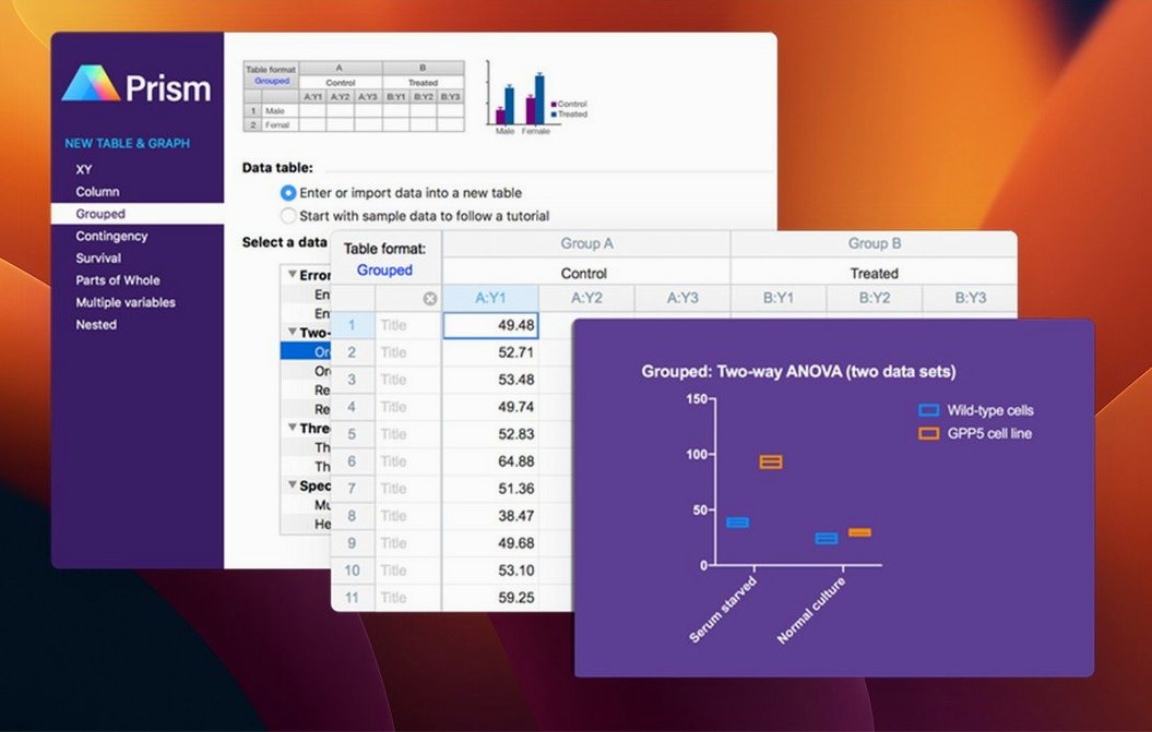
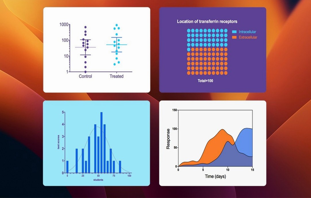
If you know your way around Excel's charting limits, Prism is designed to handle the statistical rigour and graph types Excel leaves out. Version 11.1.0, released 2026-08-19, brings over 60 bug fixes alongside a handful of targeted new features. For a newcomer, the best returns come from exploring sections that immediately show where Prism differs from a standard spreadsheet. Here are the first concrete items to test.
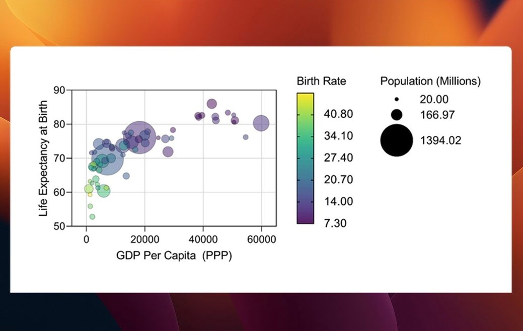
- Create a Multiple Variables data table. Start with the new graph types. From this table structure you can now generate bars, box-and-whisker plots, and violin plots directly. These complement the existing biostatistics and nonlinear regression tools.
- Set categorical level ordering. In the data table, check the controls for ordering categorical levels. This new option gives you direct control over the sequence Prism uses on axes and in legends, avoiding the default alphabetical sort.
- Walk through a repeated measures analysis. Use one of the built-in tutorial data sets to see how Prism structures, analyses, and graphs repeated experiments in a single workflow. The flow from raw data to a publication-ready figure is the core reason to move beyond general-purpose tools.
- Test variable selection in an analysis dialog. Open any analysis and note the streamlined variable selection. This refinement cuts down scrolling in wide data sets.
These steps each touch a part of the application that distinguishes it from a spreadsheet: structured data handling for statistics, nonlinear curve fitting, and the graphing engine that links the two. The 11.1.0 additions are small in number but land exactly in that gap.
Preferences to change in your first hour
Prism ships with defaults that work for a general lab, but a few changes in the first hour save real friction later. The preferences panel holds most of them, and none require digging through plist files.
- Set your preferred graph font and size. Under Prism > Preferences > Graph, pick a font that matches your institution's publication style. Prism defaults to Arial 10 pt, but most journals want something closer to 8 pt for axis labels. Setting it once applies the change to all new graphs; existing graphs keep their own formatting.
- Switch the colour scheme early. The default colour palette leans bright. If you publish in journals that print greyscale, switch to the Greyscale with symbols scheme under Preferences > Graph before you build a dozen figures. Retroactively changing colours on scatter plots with six data sets is tedious.
- Turn on automatic file recovery. It is off by default. In Preferences > File & Printer, set the autosave interval to 5 or 10 minutes. Prism does not crash often, but a lost afternoon of curve fitting stings.
- Check the analysis default for multiple comparisons. Prism remembers the last settings used per analysis type. Run a one-way ANOVA on dummy data, pick your preferred post-hoc test (Tukey or Dunnett, depending on your field), and close the file. The next real analysis inherits those choices.
Functions hiding in plain sight
Some functions sit in plain sight but go unused for months because no dialog points to them.
Keyboard shortcuts worth memorising
Cmd+Shift+T— duplicates the current data table along with its analyses and graphs. Useful when you need to rerun an analysis with one condition changed and want to keep both versions linked.Cmd+K— brings up the floating Format Graph panel instead of clicking through the toolbar. Saves more time than it sounds like it should.- Double-click any axis number — opens the axis formatting dialog directly. Single-click selects the axis; double-click drops you straight into range, tick marks, and numbering.
- Right-click a data point on a graph and choose Go to Data — Prism highlights the exact row in the source table, even in large Multiple Variables sheets. The reverse also works: selecting rows in a data table highlights the corresponding points on linked graphs.
Hidden formatting tricks
- Drag the legend. Prism legends are not locked to one position. Click and drag them anywhere on the graph area. Holding
Optionwhile dragging snaps to alignment with nearby graph elements. - Copy a graph style across a project. Right-click a formatted graph, select Copy Graph Style, then right-click another graph and choose Paste Graph Style. All axis scaling, font sizes, colours, and symbol shapes transfer. This also works across separate project files open at the same time.
- Use the Family folder for related sheets. When you duplicate a data table, Prism groups the original, its analyses, and its graphs in a collapsible Family folder in the navigator. Rename the folder early so you are not hunting through "Family 1" and "Family 2" two weeks later.
Where Prism sits among Mac analysis apps
GraphPad Prism vs. JMP
JMP, from the SAS side of statistics, covers a broader range of exploratory methods — principal components, clustering, and predictive modelling that Prism does not attempt. Its Mac version runs well and handles large industrial data sets without slowing. The trade-off is that JMP's graphing output needs more manual adjustment to reach journal quality. Prism's graphs come closer to submission-ready by default, with finer control over ticks, error bars, and annotations. For a bench scientist running dose-response curves and ANOVAs across four treatment groups on a weekly schedule, Prism's tighter scope is a strength. For an epidemiologist slicing a dataset of 80 variables, JMP's breadth pulls ahead.
GraphPad Prism vs. OriginPro
OriginLab's OriginPro offers deeper curve-fitting toolkits — global fitting with shared parameters, more peak analysis functions, and a 3D graphing engine that Prism lacks entirely. Its Mac version has improved but still carries Windows-era interface conventions that feel heavier on macOS. Prism's advantage is the linked data-to-graph-to-analysis structure: change a value in the data table and every dependent result updates without re-running dialogs. OriginPro can do this, but the workflow is less transparent. Scientists who need batch processing of hundreds of spectra will lean toward OriginPro. Those who run four or five analyses per experiment and want to document each step in a traceable layout will find Prism faster to navigate.
GraphPad Prism vs. R with RStudio
R with RStudio and the tidyverse gives you complete control over every statistical method and plot aesthetic, and it costs nothing. The learning curve is months, not hours. Prism covers roughly 80 percent of what a biomedical researcher asks of R — t tests, ANOVAs, nonlinear regression, survival curves — with point-and-click speed and graphical output that takes far less tweaking. The gap appears when an analysis needs a custom model not in Prism's built-in list, or when reproducibility demands a script. Many labs use both: Prism for routine analyses and figure drafts, R for the custom work that Prism was never designed to handle.
Fixes for the most frequent frustrations
Graph updates do not reflect new data
A user adds rows to a data table and wonders why the graph stays unchanged. Prism links data ranges per graph. If the original graph was set to plot rows 1 to 10, adding an 11th row does nothing until you adjust the range. Double-click the graph, go to the Data Sets tab, and extend the row selection to include the new data. Alternatively, select the entire data column before creating the graph initially; Prism then uses a dynamic range that grows with the table.
Error bars default to SD when you want SEM
Prism picks standard deviation for error bars on new graphs. Most biomedical journals expect standard error of the mean. This is set per graph, not globally. Double-click the graph, find the Error Bars section, and switch to SEM. To avoid this on future graphs, format one graph to your preference, save it as a template via File > Save Special > Save as Graph Template, and apply it when creating similar figures.
Analysis results disappear after reordering sheets
Prism's navigator ties analysis results to their parent data tables. Dragging an analysis sheet out of its Family folder breaks the link, and the results vanish because Prism no longer knows which data produced them. If this happens, undo immediately (Cmd+Z) or drag the sheet back into its original folder. Prism 11 warned about breaking links before completing the move; 11.1.0 keeps that behaviour intact. If you need a different organisation, use the Notes section of each sheet instead of moving sheets out of their families.
Nonlinear regression fails to converge
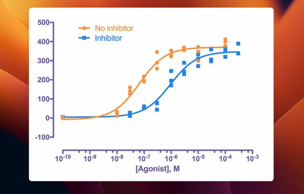
When a curve fit returns an "ambiguous" or "not converged" message, the initial parameter values are usually too far from the data. In the Nonlinear Regression dialog, switch to the Initial Values tab and enter rough estimates — the approximate top and bottom plateaus for a sigmoidal curve, for example. Prism's automatic initial values work for clean data but struggle with noisy points or flat responses.
Restructured multiple variables and estimation plots
Prism 11, as a major release, restructured the Multiple Variables data table type and added the estimation plot alongside several analysis refinements. The 11.1.0 update, from 2026-08-19, focused on rounding out that table type with graph options that users had requested since the 11.0 redesign. Bars, box-and-whisker plots, and violin plots now generate directly from Multiple Variables tables without workarounds — a practical change for anyone comparing groups across several measured outcomes in one table.
Categorical level ordering removes a long-standing annoyance: previously, Prism sorted categorical groups alphabetically, and fixing the order meant manually recoding labels or editing axis properties after every graph update. Now the order is a table-level property that all linked graphs respect. One change propagates everywhere.
The streamlined variable selection in analysis dialogs is subtle but accumulates time across a workday. In t tests, multifactor ANOVA, nonlinear regression, and simple survival analysis, the parameter dialogs now present variables in a tighter list that accounts for wide data tables with many columns. The 60-plus bug fixes bundled into 11.1.0 addressed crashes on specific macOS point releases and corrected edge cases in the Multiple Variables graphing engine that early 11.0 adopters flagged. None of these fixes add features, but together they stabilised a workflow that was rougher in the initial 11.0 run.
- Multiple variables graph types — bars, box-and-whisker plots, and violin plots now available for multiple variables tables.
- Data table ordering — categorical level ordering added for multiple variables data tables.
- Analysis dialogs — variable selection streamlined to reduce scrolling in wide data sets.
- macOS 11 or later
- Apple Silicon or Intel processor
- Interface language: English
Questions on file
Which graph types are new in Prism 11.1.0 for multiple variables tables?
Version 11.1.0 introduces bars, box-and-whisker plots, and violin plots for multiple variables data tables, expanding the visualisation options beyond earlier release capabilities.
What is categorical level ordering in GraphPad Prism 11.1.0?
It is a new feature for multiple variables data that lets you manually define the sequence of categorical levels on graph axes and in legends, rather than relying on the default alphabetical order.
Sign in · Create an account to add a field note.
No field notes yet. A measurement, a version, a machine — they appear after moderation.